

As real estate professionals, understanding local rental markets is crucial for making informed decisions, whether you’re working with investors, or clients interested in rental properties. The new Rental Percentage heatmap feature is designed to simplify this process by offering visual data on rental trends across different neighborhoods.
What is the Rental Percentage Heatmap?
The Rental Percentage heatmap visually represents rental activity within specific geographic areas. This feature shows the percentage of rentals in an area through a gradient of colours:
Cold areas (Dark Blue): Represent areas with little to no rental activity (0% rentals).
Hot areas (Red): Indicate neighborhoods’ with a high number of rentals.
This heat map allows you to easily visualize high-demand rental zones and areas where rentals may be sparse or less competitive.
The Rental Percentage is the latest addition to the existing heatmap layers that are available to premium subscribers. You can now review data visually in four layers, Average sales, Growth Rate, Market Turnover and Rental Percentage.
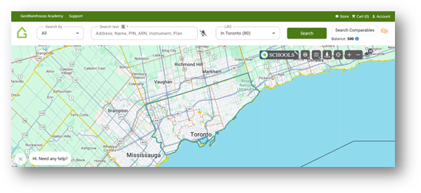
Accessing the Heat Map feature on GeoWarehouse is easy:
- Log into your GeoWarehouse account and type in your search text (Address, Name, or PIN)
- Click on Map layers and toggle on Rental Percentage and you can start to view what the rental trends in your search area look like.
This feature is accessible to all GeoWarehouse premium subscribers and real estate agents.
Source: GeoWarehouse
![]() Source: GeoWarehouse
Source: GeoWarehouse
Key Features of the Rental Heat Map
Visual Clarity: Easily grasp rental concentrations in an area. You can immediately identify neighbourhoods with high or low rental activity.
Simple Color-Coded System: Areas with no rental activity are shaded dark blue (0%), while areas with higher rental activity are shaded red.
Data Availability: If any region lacks sufficient rental data, the map will display the area in white with a label indicating “insufficient data,” ensuring clarity about where rental information might be limited.
Unlock the Power of Property Data
To learn more about the Heat Map feature, register for our upcoming training sessions in the GeoWarehouse Academy.
The continual addition enhancement to GeoWarehouse is the result of feedback from our clients through the Teranet Insighters Community. If you would like to provide your feedback and insight on other enhancements you would like to see, join the community today.